CASE STUDY
Grocery Giveaway Usability & Concept Testing
May - June 2023
Propel
Role
Lead user researcher
Team
Kaela Gallo, Rajay Lee Jambet, Jocelyn Orante
About the Organization
Propel is a social impact software company, and creators of the Providers app, a free mobile app that helps 5+ million EBT cardholders manage their benefits, access free mobile banking, save money, and earn income.
Intent
This was the first time a giveaway like this would live in the Providers app and there were a number of technical limitations that prevented us from designing the most optimal user experience. Given the specific program rules around using EBT for online grocery purchasing, we hypothesized that the specific entry rules, purchasing a certain amount with an EBT card online, would cause the most confusion.
As part of a company-wide development sprint, we partnered with our business team to de-risk a new giveaway feature. The team had only a few weeks to scope, design, and build the feature, so this research required rapid user feedback in order to fit within engineering deadlines.
Impact
Insights were delivered within the timeline, allowing for ample design iteration and comprehensive engineering development.
Given the survey results, the team made the following changes to the designs:
Eliminate any “pending” status, opting for a binary entered/not entered status for maximal clarity.
Recommended that they add “Online” to all mentions of EBT to reinforce the specific entry rules.
Changed how the team would inform winners. In addition to sending an app notification, the team would said an email.
This feature is in progress and the changes are expected to increase the click through rate by 20%.

Methods
Unmoderated user testing using Usability Hub
We ran two unmoderated Usability Hub surveys to a random sample of Providers app users. Usability Hub surveys allow respondents to answer questions after viewing specific images. We utilized multiple choice, likert scale, click heat map, and open response questions.
Sample questions
Looking at this screen, what would you click on to enter the giveaway? (Produced a heat map of clicks)
Imagine that you've purchased at least $XX of groceries with your EBT card, and now you see this screen in Providers. Based on this image, do you think you've been entered into the giveaway?
Yes
No
I don’t know
Scroll down on the image above. Read the text on the bottom of the image. How interested are you in the giveaway opportunity on the bottom of the app screen?
1 [Not interested] - 5 [very interested]
Selected Findings
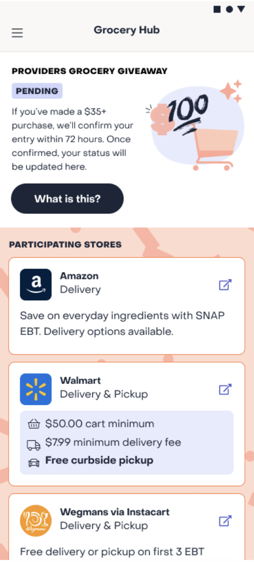
Our solution to indicate Entry status was not clear.
Majority of people understood “Entered” and “Not Entered” statuses.
For transparency, the original design included a “pending” entry status.
For the majority of respondents, this created confusion, rather than clarity, on where they were in their entrance to the giveaway.
We highlighted this as a risk for increasing Customer Support load.

Many respondents misunderstood the rules of entry because EBT online restriction.
Less than half of respondents understood the rules accurately.
More than on-fifth believed that a non-EBT purchase would be a qualifying purchase, which was incorrect.
Respondents had a strong preference to receive winner notifications via email.
Given that we infrequently communicate with app users via email, we were surprised that many expected an email if they were selected as a winner.